Clever Ads That Are On Another Level

January 8, 2023
•19 min read
Let's check out some clever advertising that is on another level!
Whether you’re looking at your phone, your laptop, or the sky outside your window, it feels like you can’t turn your head without your eyes falling on another advertisement these days. When a commercial pops up online, we’re all pretty quick to click on the ‘skip ad’ button, but this article will investigate the exceptions to the rule.
From death-defying game shows to shocking publicity stunts, let’s take a look at the ads that keep the customer watching, as we check out advertising that’s on another level!McAdvertisments
Ice cream is generally associated with a trip to the beach or a warm sunny day, so when McDonald’s started marketing their cones in snowy Sweden, they had to think outside the box.
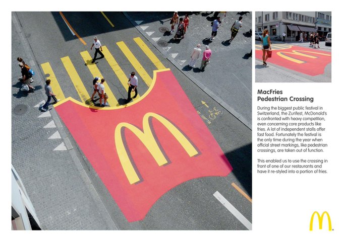
Sweden has beautiful summers, but in the winter, it’s another, much colder story. This McAdvertisement uses this extreme environment to its advantage, featuring a giant plastic ice-cream cone that gradually fills up with real snow, alongside text that tells the consumer it’s ‘never too cold for ice cream.’ The oversized ice cream isn’t the only McDonald’s dish that’s appeared in an unlikely place. Zürich City festival is one of Switzerland’s largest annual events, and back in 2010, McDonald’s converted a Swiss crosswalk into an ad for their world-famous fries, advertising their food to the hundreds of thousands of people that would attend the festival. The crispy crosswalk was positioned right outside a McDonald’s, leading festivalgoers directly to the golden arches, although, I’m not sure I’d want to eat fries after watching thousands of people trample all over them.McDonalds's Pedestrian Crossing, Züri Fäscht
Airborne Advertising
The advert-publicity-stunt-hybrid in the video below was designed to shock consumers into paying attention. Check it out.
Molar Marketing
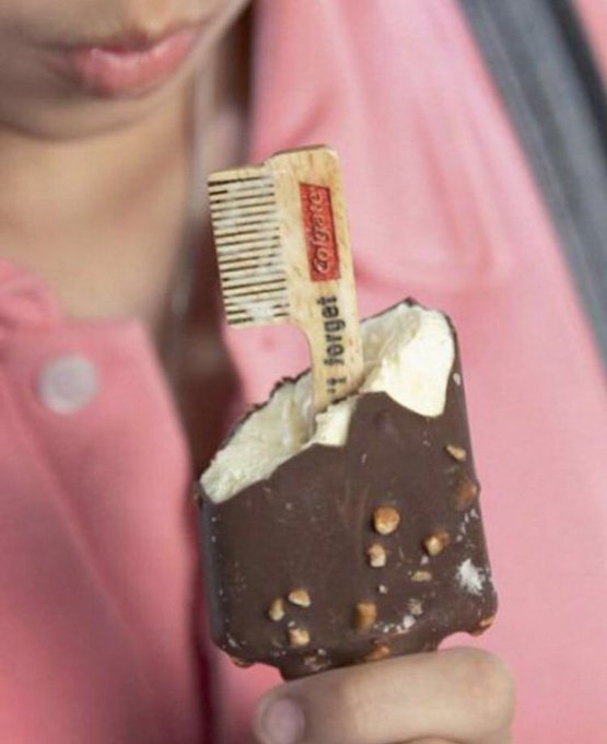
Colgate is all about clean teeth and fresh breath, so at annual events like ‘oral health month,’ the company typically gives out free samples of their plaque-purging products. Unfortunately, crowds are never overly excited about miniature tubes of toothpaste, so in 2009 the company decided to go in the opposite direction, handing out sweet treats to their customers.
Creative guerrilla marketing idea by Colgate..🦷 Don't forget to brush your teeth after eating ice cream! 😋
A Cut Above The Rest
There’s only one thing professional soccer players like more than scoring goals: getting their hair cut. When Brazil’s main soccer league ‘Serie A’ banned alcoholic sponsorships on jerseys back in 2021, Brazilian beer brand Brahma had to think of a creative loophole to circumnavigate the rule.
They decided to capitalize on soccer’s love of hair, inventing a new hairstyle that resembled a glass of foaming Brahma beer, and marketing it to soccer fans on social media. The campaign is an example of Guerrilla advertising, a marketing style that uses surprising and unconventional methods to promote a product. Remarkably, the haircut became so popular, Brazilian players started to wear it on the field, offering Brahma free advertising without breaking Serie A’s rules and regulations. Getting your customers to advertise for you, now that’s how you trim away any competition!Word in Mouth
Let’s shift gears, cruising on from guerrilla advertising to a roadside billboard. An Austrian rest stop chain called Oldtimer managed to create a billboard that’s impossible to avoid, turning an entire road-tunnel into one gigantic advertisement.
Fireworks Alfredo
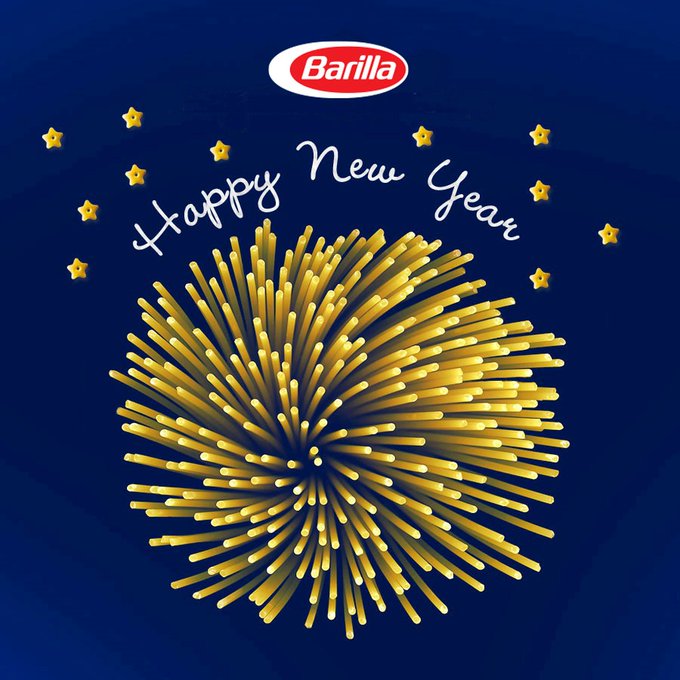
This next advertisement is a New Year’s billboard from Barilla, who said pasta la vista to 2010 by showing a cluster of spaghetti arranged to look like a New Year’s firework.
Happy New Year! It’s time to celebrate, we will see you in 2021! 🎆
Killboards
From a tasty ad to one that’s a little more gross, this next billboard from insecticide brand ORPHEA involves a collage of dead insects. When it first appeared in 2013, the advertisement looked blank, simply showing a can of ORPHEA’s insect repellent.
However, the advertisement was actually a giant flytrap, the blank surface being covered in a layer of transparent glue.As the hours and days went by, the lights around the billboard started to attract thousands of mosquitoes and flies, and as the insects hit the advertisement, their bodies completely changed the image, creating a dark ‘spraying-pattern’ out of the can’s nozzle.Real Life Sci-Fi
We’ve looked at a few innovative billboards so far, but this next piece of futuristic advertising comes straight out of a science fiction movie. Cities around the world are now boasting 3D billboards, hyper-realistic advertisements that have been heralded as the ‘future of advertising.’
These billboards are used to promote everything from TV shows to technology, and no matter what they’re displaying, the 3D animations are bound to stop people in their tracks.From the corner of the box-shaped billboard, the forced perspective causes this high-definition kitten in Tokyo to look ultra-realistic, purring at pedestrians as they walk below. However, if you approach the billboard from a different direction, that’s one flat cat.Sneaky Sponsorship
FIFA is one of the biggest video game franchises in the world, so an advertising spot on one of their in-game virtual billboards can be pretty pricey, reportedly costing up to $500,000.
Burger King decided that they wanted to have their logos featured in the game, without spending the big bucks, so the marketing team came up with an ingenious campaign to get the job done.Burger King sponsored the real-life jerseys of Stevenage FC, a tiny soccer team at the bottom of England’s 4th division. Stevenage weren’t a popular team, but they were featured in FIFA 20, meaning that when Burger King slapped their logo on Stevenage’s real kit, their branding would automatically be found inside the game. They then introduced the ‘Stevenage Challenge’ online, telling FIFA fans that if they scored a goal with Stevenage and shared it on Twitter, they’d win a real, edible reward on the Burger King app. The campaign was a whopper success, and Stevenage soon became the most played team on FIFA. Over 25,000 goals were shared online, and for the first time, Stevenage’s jerseys sold out in real life.A Pixelated Problem
Next up we have an advertisement from the WWF, the World Wildlife Fund, an international organization that aims to protect endangered animals.
In 2008, they started a pixelated print campaign in which the number of pixels used in the images were the same as the number of individuals in the species that are still alive. The prints showcase Giant Pandas, Cross River Gorillas, Ethiopian wolves, and Japanese Golden Eagles, and the more pixelated the image, the closer the species is to extinction. The touching campaign gave a new definition to the term Guerrilla marketing, and today, Giant Pandas are no longer classified as endangered animals, meaning the vulnerable creatures can now be portrayed in a slightly higher definition.Makeshift Marketing
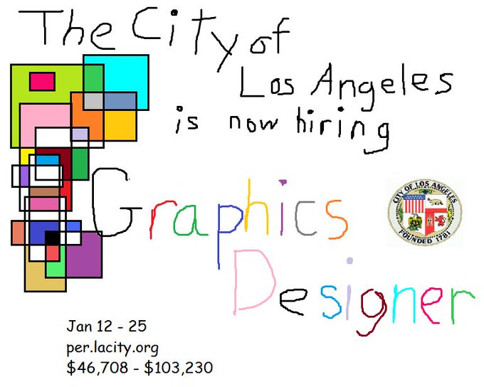
When it came time to hire a new in-house graphic designer in 2018, the City of Los Angeles came across a unique problem, who was going to design the job advertisement?
Instead of paying for a freelance designer, the social-media team decided to create the ad themselves. The ad looks like it was made by a 7-year-old, but the city didn’t just hang little Timmy’s artwork on the fridge. They shared it to Twitter, and the job advertisement went viral online.Creepy Commercials
A horror movie is only really scary if the viewer is totally immersed, but the marketing team behind the release of The Ring Two took the pursuit of realism a bit too far. In The Ring, the characters watch a haunted videotape, and when the video ends, they receive a phone call from a ghostly voice, telling them that they’re going to die in 7 days.
For the sequel, marketing consultancy New Media Maze played into this storyline, encouraging fans to visit a website and input a friend’s email address and phone number. The site would then send that friend an email, with a link to watch The Ring Two’s trailer online. As the trailer played, the friend’s phone would start to ring, and if they picked it up, a spooky voice would whisper ‘7 Days.’If someone pulled this trick on me, I wouldn’t leave the house for weeks, but it turns out, the campaign caused a ton of movie-goers to change out of their soiled pants and head straight to the cinema, The Ring Two grossing $163.9 million on a $50 million budget.A Bloody Good Billboard
In 2020, the BBC advertised their adaptation of ‘Dracula’ with a bloodcurdling billboard. In the day, the billboard showed a plain white background, stuck full of bloody wooden stakes. A glass box sat on street level, meanwhile, containing a single wooden stake, providing pedestrians with a weapon ‘In case of vampires.’
Luckily for the citizens of England, vampires aren’t real, right? Well, you can always count on the Count to come out at night.This billboard design takes Dracula’s shape when the sun goes down.
Spanish For Sips
At first, this next campaign looked like an ordinary Corona vending machine, sitting on a busy street in Las Vegas. But whenever a pedestrian walks past, the vendor automatically offers them a free can of Corona’s new hard seltzer lemonade on one special condition: this voice activated machine accepts Españ-only.
Coiled Campaign
Back in 2010, the marketing team at Copenhagen Zoo crushed it, creating an ad that’s literally straight bussin. It might look like a shot from a new disaster movie, but this is an advertisement for the zoo, showing a boa constrictor coiled around a city bus and squeezing it tight.
As the bus snaked its way through Copenhagen’s streets, it was bound to attract some attention, and Copenhagen Zoo went on to become one of the most visited locations in Denmark that year.Art-vertisement
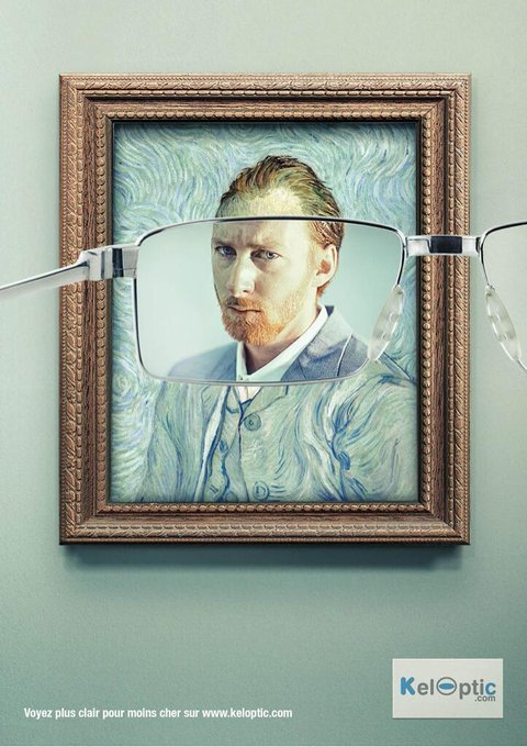
Some of the advertising campaigns that we’ve looked at are arguably works of art, but the print ads by French eyewear store KelOptic belong in a gallery. The company showed a set of impressionist paintings, an art style that’s famous for using dots and visible brush strokes to create distorted versions of realistic images.
The advertisement shows somebody holding a pair of KelOptic glasses up to the painting, and when viewed through the lenses, the famous paintings appear hyper-realistic.[Les Van Gogh] LOS IMPRESIONISTAS otra campaña publicitaria de Y&R para la marca @Keloptic #arte + #publicidad :
Rob me if you can
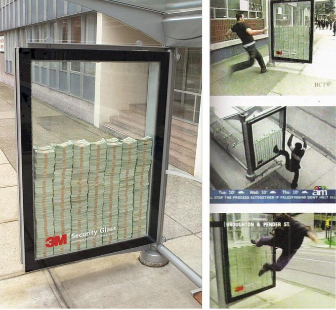
Back in 2005, 3M gave a new definition to the term ‘bill-board,’ creating a reinforced glass box and filling it with 3 million in dollar bills. The glass was strengthened by a layer of 3M’s extra-strong security film, and the company placed the box on a sidewalk in Vancouver, encouraging pedestrians to try and shatter the glass and take the money.
In 2005, a glass company set up a bullet-proof glass poster case containing $3 million at a bus stop in Vancouver, Canada. If anyone was able to break the glass they got to keep the cash. Nobody succeeded, despite plenty trying.
Breaking the Mold
The meals shown in fast food advertisements are typically a long way away from the food that you actually pick up at the drive-thru. But in 2020, Burger King decided to break the mold, literally, starting an ad campaign that centered around images of a moldy whopper.
The TV commercial showed the burger progressively rot over the course of 34 days, before finishing with an important message, stating that the unappetizing mold is actually ‘the beauty of no artificial preservatives.’Gritty Gamers
To promote the launch of ‘Rise of the Tomb Raider’ on Xbox One, Microsoft placed 8 contestants on a huge billboard in London, putting them through a test that they called the ‘Survival of the Grittiest.’
The contestants could leave the billboard at any time, but only the last remaining participant would take home a prize. A live audience on twitch controlled the conditions on the billboard, subjecting the participants to artificially created blizzards, downpours, or sweltering heat.Two in One
With their plastic pens, lighters and razors, French company Bic makes a ri-bic-ulous assortment of products. Back in 2015, the company decided to shave some money off of the marketing budget, advertising both their razors and pens on one single ad.
This guy’s clearly fallen victim to a horrible prank, but he’s got nothing to worry about, able to shave off his ballpoint beard with his trusty Bic razor. These advertisements appeared inside a magazine, and interestingly, they ran a page apart. This meant that as a reader flicked through the magazine, they’d pause on the second image, thinking that they were seeing the same ad twice. In theory, they’d then go back to the previous page, playing an impromptu game of ‘spot the difference’ as they made sure that they weren’t seeing things.Knock off the knock off’s
The world is full of thrifty sneakerheads, donning shoes from brands like Mike, Calvim Klain, and Abibas. Adidas decided to do something about the knockoffs, releasing a series of ads that highlighted how real Adidas sneakers are designed to offer you comfort and protection, unlike poorly made fakes.
The company combined their famous 3-stripes logo with images of foot injuries, showing that if you wear fake sneakers, you’re going to injure your feet, and when it comes to athletics, it’s 3 stripes or you’re out.Bright Ideas
British newspaper The Economist is all about serious journalism, but back in 2005 someone in their marketing department had the idea of borrowing a trick from Saturday-morning cartoons.
Pillboard
Coming up with an advertising campaign seems like a real headache, but that’s where pain medications like Tylenol come in. Back in 2008, Tylenol asked the team at J. Walter Thompson to sugar coat their pill, creating an advertisement that would beat out the competition.
The team decided to depict a head-wrecking headache by building a fake crane and wrecking ball that appears to be smashing through a man’s forehead. The attention-grabbing ad had a clear message, the pill-board encapsulating what Tylenol capsules are all about, helping you when your head really, really hurts.A Sensational Sticker
Using a wrecking ball in your advertisement is pretty impressive, but all petcare company Frontline needed to advertise their business was a single, large sticker.
From the ground, the advertisement in Jakarta, Indonesia must’ve seemed a little strange, but when you viewed the giant sticker from a few floors up, the unwitting pedestrians walking over the dog looked just like ticks and fleas.Stationary Stunts
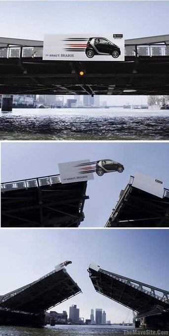
Smart cars are famously great at parking it tight spaces, but they aren’t exactly known for being fast, so when the company released the sporty Smart Brabus back in 2007, they wanted their advertisements to focus on the car’s speed.
They made this happen when the bridge the car was advertised on opens up! The chosen bridge in Rotterdam is a ‘bascule bridge,’ meaning it can open in the middle, allowing the smart billboard to show the world the speed and power of the Brabus as it flies over the river.To highlight the powerful upgrade of the Smart car - the brand created an ambient installation on a bascule bridge in Rotterdam - creating the illusion of the tiny car making an epic jump Agency: BBDO Dusseldorf. #marketing #advertsing
Con-mercials
Miele is a German manufacturer of domestic appliances, and when they released their new S8 vacuum cleaner in Slovakia, they wanted to prove that the product could vacuum up absolutely everything, even cars and trucks.
Unlike the S8, the tunnel converting billboard definitely doesn’t suck, however, after releasing images of the advertisement online, Miele revealed the billboard’s big twist: it never existed.The Toughest Toothpaste
While marketing Formula toothpaste in Indonesia, advertising agency Ogilvy & Mather definitely knew the formula to making a great billboard.
Formula’s motto is ‘builds strong teeth,’ and the advertisement represented this by showing a guy chewing straight through the ad’s metal scaffolding. This simple illusion is created by using extra pieces of black metal, bent and twisted into shape.Milk Boy
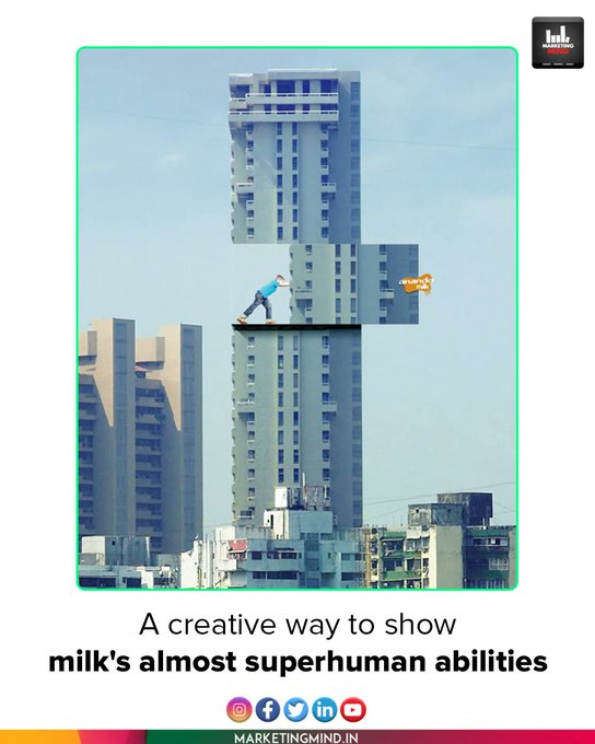
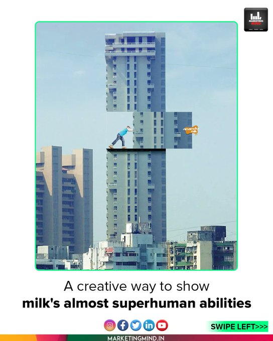
Back in 2008, Indian milk company Anando created a marketing campaign that aimed to drag kids away from soda and water, proving that drinking milk was the only way to grow big and strong. This superhuman kid has clearly been hitting the milk bottle hard, his calcium-filled bones allowing him to move skyscrapers like Jenga blocks.
The billboard was developed by McCann ad agency, and it works by hanging over the edge of the skyscraper, its blue background blending into the sky behind it.Anando Milk placed a clever hoarding showing almost superhuman abilities from milk #MarketingMind #Billboards

