Famous Logos With Hidden Meanings

April 24, 2025
•19 min read
Here are some mind-blowing famous logos with hidden meanings!
Do you ever feel bombarded by logos left, right, and center? Everywhere you look, companies are constantly fighting for your attention, and they do this by creating interesting idents that you immediately associate with their products. At first glance, most of these are just fun or colorful emblems, but when you look a little deeper, some of them reveal creatively hidden features that you probably never noticed before! Let's investigate the hidden meanings behind the logos you see every day!
The Secret Behind 3 Dots On Domino's Logo
It's likely that by just thinking of the iconic Domino’s Pizza logo, many of you started salivating! But when you really think about it, what does a classic game of dominos have to do with Pizza? It turns out, it doesn’t! Back in the 1960’s, DomiNick’s Pizza Restaurant had to be renamed following a buyout by American entrepreneur Tom Monaghan.
But he wasn’t allowed to use the existing name, and, at the time, he didn’t have the money to hire in million-dollar-marketing experts. So, he began asking his employees for suggestions! That’s when a pizza delivery boy threw the name ‘Domino’s’ out there, and Monaghan liked it!
The Secret Film Reel Behind The Iconic Netflix "N"
Netflix wasn’t always the streaming powerhouse we know and, thanks to the pandemic, rely on today! It started out back in 1997 as a DVD rental company, nearly 10 years before the first iPhone was invented! Back then, its logo was an old school film reel separating the words Net and Flix, making it pretty clear that this was some kind of internet-based film ordering service.
But as technology began to change, Netflix shifted their focus from DVD delivery to online streaming. Their logos began to change with the times and seeing as streaming itself has no universally identifiable icon, Netflix just let its name do all the talking!The Twitch Glitch
Livestreaming has become one of the most popular forms of online entertainment today, but the king of all these streaming services is the one and only Twitch! In January 2021, nearly 2 billion hours of content were watched on its platform, where streamers broadcast everything from video games to real-time chats with their virtual audience. But as well-known as it is today, not many people know where that little purple mascot thing comes from, or even what it is!
To figure this out, let’s rewind 10 years to when Twitch, then known as Twitch TV, was first launched. Back then it was marketed as the world’s largest competitive video gaming network, found exclusively on the URL twitch.tv. Its logo was grey with a rockband-ish type font, designed to resonate with old-school gamers. But as esports and gaming became more and more popular around the world, Twitch began to thrive. By 2012, they had a whopping 20 million visitors a month! It was so large that the TV part of their name had become redundant, and so they renamed the service, quite simply, to Twitch.The Meaning Behind Sony Vaio
When you think about some of the product placement in the James Bond film franchise, most people remember the logos of the fancy cars, expensive watches, and premium vodka. Shaken, not stirred, obviously!
Although there’s one in 2006’s Casino Royal that looks a little out of place. The Sony Vaio laptop is used in plenty of shots of Bond plotting some serious espionage, hacking into things, and replying to some very important emails. But its name and logo look so strangely cryptic that even Bond would have a hard time cracking this code!Tour De France's Hidden Cyclist
You don’t have to be a fan of cycling to know that the Tour de France is the most prestigious cycling tournament in the world. Racing 2,000 miles over the idyllic French countryside in just 23 days is a challenge that attracts the very best cyclists from around the world! But they also come thanks to the event’s impeccable marketing. The Tour de France logo used to be a very austere looking icon, incorporating block letters surrounded by the dials of a speedometer.
Very official and competitive, but this all changed in 2003 to celebrate the race’s 100th anniversary. Their whimsical font and colorful circle gave the entire logo a more Gaelic feel, but a smartly subtle detail was also worked into the mix. See those two little dots inside the "O" and right beside "R"? Well, if you take away this portion of the wording, the letters are arched specifically towards that yellow circle to look like a cyclist pedaling for his life!

The Starbucks Siren
If you’d never seen the Starbucks logo before, what would you think it sold? With that great green and white siren holding two fishtails, you’d be forgiven for thinking they sold seafood! After all, mermaid princesses and coffee aren’t exactly the most classic combination.

Pizza Hut’s Hat
Did you ever go to Pizza Hut as a kid, or at least before the rise of the pizza delivery era? These restaurants served pizzas, sides, salads and desserts all under one roof! But to many people, the Pizza Hut logo itself is something of a mystery.
What exactly does a sombrero in a red circle have to do with pizza? From Indiana to Kuala Lumpur, this hat-shaped logo sits faithfully beside the Pizza Hut name, with no context whatsoever. So, where does it come from?
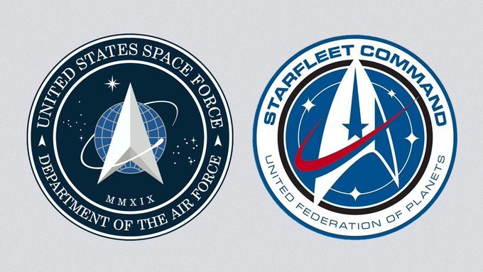
Space Force Logo
At the beginning of 2020, President Trump did what he did best and took to Twitter to unveil the logo of the United States’ brand-new military division: Space Force!
After consultation with our Great Military Leaders, designers, and others, I am pleased to present the new logo for the United States Space Force, the Sixth Branch of our Magnificent Military!
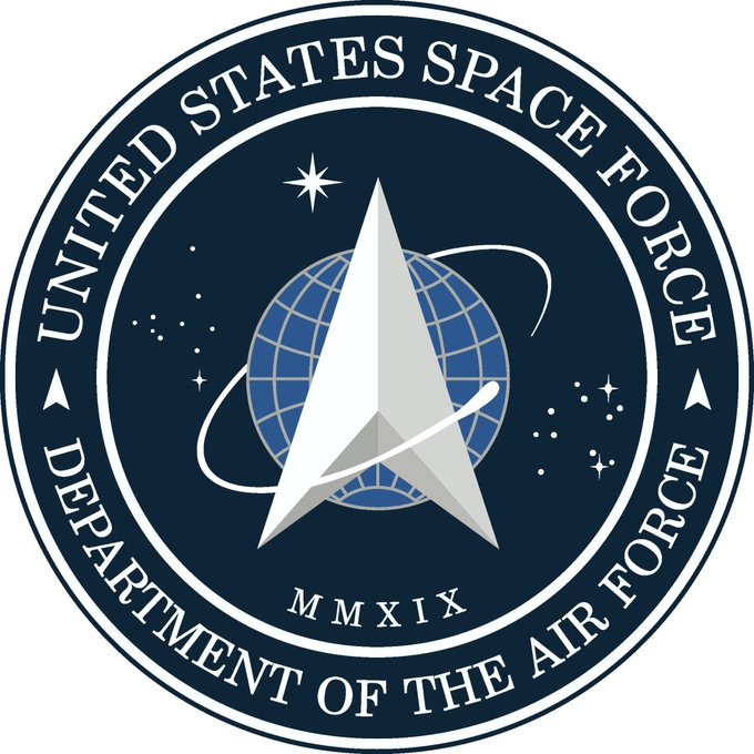
The Trump administration's new Space Force logo looks a lot like another space visual: the Star Trek insignia. axios.com/trump-space-fo…

Pepsi's 1 Million Logo Redesign
The Pepsi logo has become so iconic that during the 2018 Winter Olympic’s opening ceremony, some people thought the red and blue South Korean flag was a giant Pepsi logo!
개회식 이건 오진거 ㅇㅈ한다

Hershey’s Kiss Hiding In The Kisses Logo
Hershey’s Kisses are possibly the only kisses many people received this Valentine’s Day. But for those who’ve never heard of these sweet treats, they’re one of the most popular candies available in the US and have been manufactured for over 100 years!
Their logo started off with some classic, old timey font, and was gradually modernized over the decades. But in 2003, their little logo update included a tactfully hidden image! Can you see it in the image below?Embed for https://x.com/HAPPYTI73849895/status/349964102539558912 could not be displayed

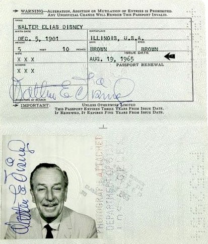
The Walt Disney Logo Isn't His Real Signature
We all know the classic, curling signature that appears in the ident at the beginning of many of our favorite childhood films. It belongs to Walt Disney, the internationally renowned animator, voice actor and film producer.
Take a look at the Walt Disney Passport Signed twice (as required for passports) by Walt himself the passport was used just once for a trip to London in 1965. Walt Disney signatures are highly collectable.
Levi's Batwing
Jeans all look the same, but there’s one brand that really stand out from the crowd thanks to a little red label: Levi’s! But the red tab isn’t the only distinguishing feature that some Levi jeans sport. On the back pocket of their trademark 501 jeans are two stitched arches that meat in the middle.
This pattern is affectionately called the Batwing, but while it looks pretty perched on someone’s derriere, it also has a little history behind it as well. Levi Strauss & Co was established all the way back in 1873 after patenting a pocket fastening design. The company began branding its jeans with the iconic two horse patch, which included that very early batwing design!
Hidden Bear On Toblerone Logo
Toblerone is a uniquely shaped Swiss chocolate bar made up of triangles of snappable chocolate combined with delicious nuggets of nougat! The inspiration for its delectable design and lovely logo comes, pretty clearly, from the famous Swiss mountain, the Matterhorn. But there’s a secret hiding in the shadow of this mountain, literally!
Brace yourselves because once it's revealed, you’ll never be able to unsee it! Right there inside the circle, hidden in all the negative space is a bear standing on its hind legs! But what has a bear got to do with chocolate? Well, it’s actually a reference to the birthplace of this triangular treat, which is the city of Bern, Switzerland. The city has an angry looking black bear prowling across its coat of arms, although Toblerone’s white bear isn’t nearly as scary looking! Not only that, but the name Toblerone itself, which is a combination of Tobler, the creator’s family name, and Torrone, the Italian nougat, contains all the letters of Bern! Just how much sweeter could this marketing treat be?

The Secret Meaning Behind The Beats Logo
Simplicity is a a make-or-break factor for many logos! Fortunately for Beats Electronics, the simplicity of both their name and logo has helped make them a super successful brand.
Set up by music industry legends Dr Dre and Jimmy Iovine, the lower-case b on a red circular background has become synonymous with their premium audio products! But for all its simplicity, there’s some serious genius in its design. Because if you take a step back, it also looks like someone wearing headphones from the side!TikTok Logo
When Muscial.ly popped up on the app store back in 2014, teens all over the world hit the download button and began recording themselves lip syncing to their favorite songs.
It was a certified hit, but less than 2 years later a lip-sync competitor waltzed onto the app scene under the name of A.me. Its name didn’t really tell users what it was, and its logo was a shady looking pink musical note. Needless to say, it didn’t pose a threat to Musical.ly’s reign. That was until December 2016, when A.me changed its name to Douyin and its logos suddenly transformed into something you might recognize. That’s right, A.me had in fact been TikTok’s very first evolution! The new, and now iconic, logo was designed to emulate the feeling of being in a large crowd, looking up at a bright stage! And the colorful overlays came from running the design through an electronic wave effect, which gave it a stand-out 3D appearance from other apps. With this new look, Douyin quickly began to thrive, and within a year it had more than 100 million users! While Douyin focused on the Chinese market, its parent company, Bytedance, developed and launched its twin TikTok to the international market under the same branding! Then, in 2017, ByteDance bought Musical.ly for $800 million and merged it with Tiktok to create one, unstoppable lip-syncing application!

Toyota Logo Spells Toyota
The three interlocking ovals of the Toyota Motor corporation is one of the most recognizable automobile related logos in the world. But as simple as it looks, there’s a lot going on within it.
The company itself was founded by Kiichiro Toyoda back in 1937 as a spin off from his father’s company Toyoda. Kiichiro adjusted the company’s name to Toyota because it sounded better and could be written in Japanese in eight strokes of a pen. 8 is considered to be a very lucky number in Asian culture, as it’s associated with prosperity and wealth. And clearly, for Toyota, 8 really was their lucky number! The company took the world by storm, and in 1989, to celebrate their 50th anniversary, they unveiled their new oval logo. It symbolized the overlapping trust of the customer and the company, and the horizontal layout made sure it could be recognized even when looking back at it in a rearview mirror. That’s pretty clever, but there’s something even more impressive hiding inside all those ovals. When you break it down, each overlap ingeniously spells out every letter in Toyota’s name! Not only that, but, at a glance, it also looks like it contains that oh-so-important number 8! Now that’s a stroke of genius and luck.
Hyundai Logo Is Actually Two People Shaking Hands
Like their Toyota counterparts, the Hyundai Motor Company is also one of the most infamous names in the automobile market. Although it didn’t always sport that iconic italicized H as its logo! The South Korean company was founded in 1967 and decided to enter the market with the image below as its official emblem.


